

Introduction
Ever thought of building a sleek website with a WebAssembly CMS? Bartholomew has got you covered! Bartholomew is one of the few projects that is making WASM CMS accessible. With Bartholomew, you can create a website that is fast, scalable, and easy to manage using only Markdown. If you do not know about the commenting system for blog articles called Hyvor, you have come to the right place. Basically, we will be working on styling and adding other features. Also, we will be using Font Awesome for the footer section.
Getting Started
We are starting out with baby steps. Firstly, ensure you have your Spin CLI installed locally. You can follow the Spin Quickstart guide for learning and practicing how to install the Spin Binary.
Here's the command to use for installing the latest version of the Spin CLI:
$ curl https://spin.fermyon.dev/downloads/install.sh | bash
Ensure you verify the version of the Spin CLI you installed. Here is a way to verify it:
$ spin  - -version
spin 0.5.0 (b9fedcc 2022-09-02)
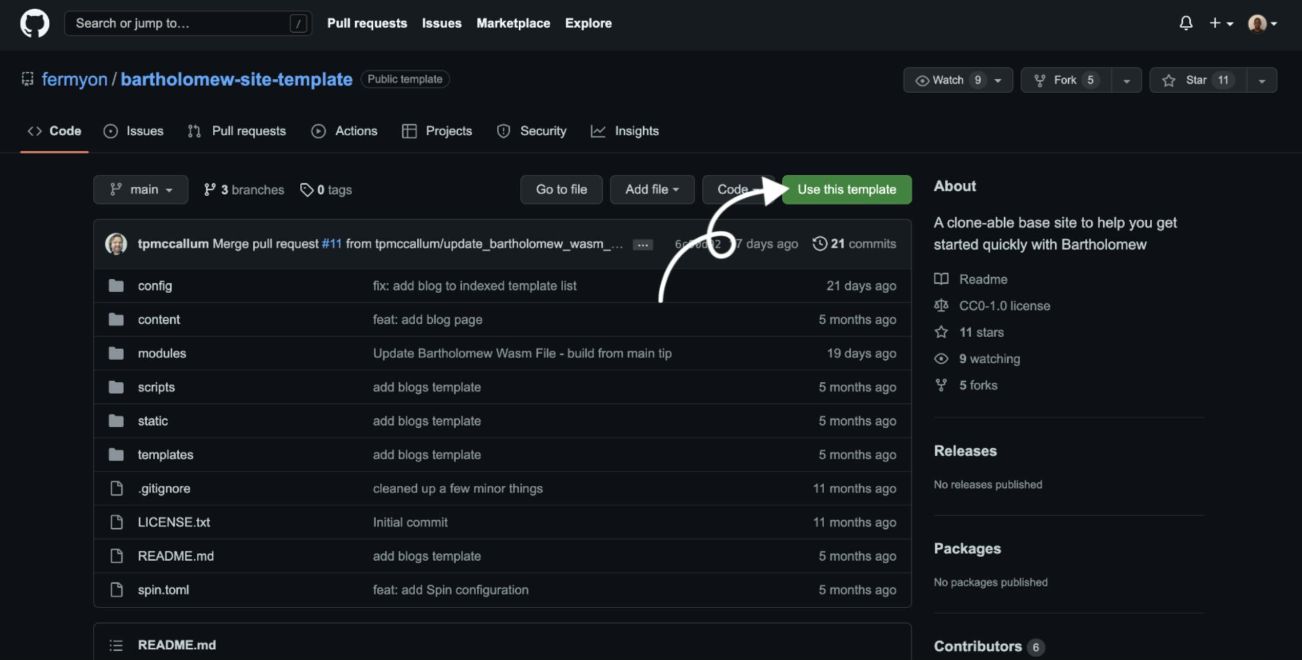
After doing this, you need to navigate to Bartholomew's site template - that’s the template we will be building from. You need to visit the template’s location on GitHub, and click on the “Use this template button” just as you can see in the image below.
After using the template, it helps you create a repository. After creating the repository, you should clone the repository with the command below:
$ git clone <your-github-account> <your-repo-clone>
Next, you have to navigate to the repository you just cloned:
$ cd <repo-name>
Ensure you have your Spin CLI in the path because we’ll be using Spin to run the site. You need to ‘spin up’ your site to launch it on localhost:
$ spin up --follow-all
Next Step:
Creating your first blog post for the site is the next thing to do after setting up the project and launching the site on localhost.
Creating Your First Blog Post
You need to specify the title, template, and author in the command when trying to create any blog post in Bartholomew – here’s a way to do that:
$ mkdir content/blog
$ bart new post content/blog samplename.md --author “Sample name” --template “blog” --title “Sample title here”
You should get an output just like this:
Wrote new post in file content/blog/samplename.md
You can also validate your content by using this command:
bart check content/blog/*
Then it should give this result, if the syntax in the .md file is correct:
✅content/blog/samplename.md
You can use the spin up --follow-all command to view changes. It should be something like this:
Time to Get Our Hands Dirty 👐
How It Works
The UI and layout are handled via templates in the ‘/templates’ directory. Bartholomew works with Handlebars for its template - the version of Handlebars is written in Rust.
For scripting, Bartholomew uses Rhai (a simple scripting language for Rust). It is very easy to work with this.
The markdown files work directly with the Handlebars template. In the handlebars template, you’ll find some strings, and the strings work with the content that is in the markdown file.
First Steps
Firstly, in the ‘site.toml’ file, you need to declare that the index site pages will consist of the index page itself and the blog. We will fetch some information from the blog in the index page.
Here’s a code we should bring in the 5th line ‘spin.toml’ file:
index_site_page = [“main”, “blog”]
Let’s start working with the ‘content_top.hbs’ file. One thing you need to know is, you’ll also be working with Bootstrap and Font Awesome for the footer. I used the Poppins font - you might use any font you want to, but I’ll also be linking that in the <head> section of the ‘content_top.hbs’ file.
Here is a piece of code you should have in the head section in the file.
<meta name="description" content="{{page.head.description}}">
   <meta name="viewport" content="width=device-width,initial-scale=1,maximum-scale=1,user-scalable=no">
<meta http-equiv="X-UA-Compatible" content="IE=edge,chrome=1">
<meta name="HandheldFriendly" content="true">
   {{/if}}
   <!--Font-->
 <link rel="preconnect" href="https://fonts.googleapis.com">
 <link rel="stylesheet" href="https://maxcdn.bootstrapcdn.com/font-awesome/4.4.0/css/font-awesome.min.css">
<link rel="preconnect" href="https://fonts.gstatic.com" crossorigin>
<link href="https://fonts.googleapis.com/css2?family=Poppins:wght@300;400&display=swap" rel="stylesheet">

   <!-- Twitter Bootstrap -->
   <link href="https://cdn.jsdelivr.net/npm/bootstrap@5.1.0/dist/css/bootstrap.min.css" rel="stylesheet"
       integrity="sha384-KyZXEAg3QhqLMpG8r+8fhAXLRk2vvoC2f3B09zVXn8CA5QIVfZOJ3BCsw2P0p/We" crossorigin="anonymous">
   <!-- JavaScript Bundle with Popper -->
   <script src="https://cdn.jsdelivr.net/npm/bootstrap@5.1.0/dist/js/bootstrap.bundle.min.js"
       integrity="sha384-U1DAWAznBHeqEIlVSCgzq+c9gqGAJn5c/t99JyeKa9xxaYpSvHU5awsuZVVFIhvj"
       crossorigin="anonymous"></script>
This is just to get things ready — I just got the CDNs to get Bootstrap and Font Awesome working.
You’ll notice I used this in the <head> tag:
 <meta name="description" content="{{page.head.description}}">
   <meta name="viewport" content="width=device-width,initial-scale=1,maximum-scale=1,user-scalable=no">
<meta http-equiv="X-UA-Compatible" content="IE=edge,chrome=1">
<meta name="HandheldFriendly" content="true">
This was done just to make the website responsive for all devices.
NOTE: The content_top.hbs file should not have an end; there should be no closing tag for the page just like a random HTML file will have the </body> and the </head> tag as the components of this page will be linked to some other pages too.
Next, in the <body> tag that has no end tag, you should add this in the code:
<div class="container" id="main-container">
       {{> navbar }}
       <main>
    <div class="night-toggle" onClick="switchMode()">
 <div id="moon" class="moon"></div>
</div>
<!-- optional -->
<div class="opt">
 <div><h1>John Doe's Blog ⚡️ </h1></div>
 <div class="break"></div>
 <div><p>Created by <a href="https://bartholomew.fermyon.dev">John Doe</a> with bartholomew.</p>  <br>
</div>

<div class="container">
  <div class="row">
In the code above, we created a div for the dark mode feature. We classified it as night-toggle and used the onClick=”switchMode()” because we want the dark mode to pop up when we click the button.
Another thing we did was create a header for the blog and a mini description in the <div class=”opt”> section.
One thing you also shouldn't do is close the last two lines of code in the content_top.hbs file. The content_top.hbs file was created to work for all pages. Next, we’ll get started with styling and writing some scripts for the dark mode with some JavaScript code.
For the styling, let’s head back over to the <head> section because we want to style the dark mode by using internal CSS. Here is the code to you should use:
<style>
       body {
           margin-top: 7em;
           font-family: 'Poppins';
       }
       .card-title, .card-text{
           color: #000;
       }
       nav {
           margin-bottom: 1em;
       }

       .learn-more-card-group {
           margin-top: 2em;
       }
       .blog-post-meta{
           text-align: center;
       }
       body {
transition: 0.8s;
}
.night-toggle {
width: 33px;
height: 33px;
right: 20px;
top: 20px;
position: absolute;
}
.night-toggle:hover{
 cursor: pointer;
}
.moon {
 background-color: transparent;
 box-shadow: -6px 1px 0 3px #275e8e;
 border-left:3px solid #27476D;
 border-radius:50%;
 width: 20px;
 height: 20px;
 margin-left:8px;
 margin-top:0px;
 transition: 0.8s;
}
.sun {
 background-color: #fdd462;
 box-shadow: 2px 0px 0px 1px #D19C29;
 border-radius:50%;
 width: 26px;
 height: 26px;
 transition: 0.8s;
}
/* ----- optional ----- */
.break {
 flex-basis: 100%;
 height: 0;
}
.opt{
   text-align: center;
}
:root {
 --font-family-primary: 'Vollkorn', serif;
 --font-family-secondary: 'PT Sans', sans-serif;
  --font-size-title: 32px;
 --line-height-title: 1.4;
 --font-size-caption: 14px;
 --line-height-caption: 1.2;

 --border-radius-primary: 32px;
}


* {
 -webkit-font-smoothing: antialiased;
 -moz-osx-font-smoothing: grayscale;
}

@mixin mediaBig {
 @media (min-width: 576px) {
   @content;
 }
}

@include mediaBig {
 :root {
   --font-size-title: 40px;
 }
}
.cardo {
 max-width: 960px;
 border-radius: var(--border-radius-primary);
 box-shadow: 34px 34px 80px rgba(0,0,0,0.1);
 padding: 20px 20px 28px 20px;
 box-sizing: border-box;
 margin: 20px;
 display: flex;
 flex-direction: column;
  @include mediaBig {
   flex-direction: row;
   align-items: center;
   margin: 40px;
   padding: 32px;
 }
}

.card__image {
 width: 100%;
 max-height: 300px;
 border-radius: var(--border-radius-primary);
 object-fit: cover;
 margin-bottom: 18px;
  @include mediaBig {
   width: 45%;
   max-height: none;
   min-height: 400px;
   margin-bottom: 0;
 }
}

.card__content {
 @include mediaBig {
   width: 55%;
   padding-left: 40px;
 }
}

.card__date {
 display: block;
 font-family: var(--font-family-secondary);
 font-size: var(--font-size-caption);
 line-height: var(--line-height-caption);
 text-transform: uppercase;
 color: var(--color-text);
 margin-bottom: 6px;
  @include mediaBig {
   margin-bottom: 8px;
 }
}

.card__title {
 font-family: 'Poppins';
 font-size: var(--font-size-title);
 line-height: var(--line-height-title);
 color: var(--color-text);
 box-decoration-break: clone;
 background-image: linear-gradient(90deg, var(--color-highlight-primary), var(--color-highlight-secondary));
 background-size: 100% 42%;
 background-repeat: no-repeat;
 background-position: 0 85%;
 padding: 0 4px;
 margin-left: -4px;
}
footer{
 text-align: center;
}


   </style>
Firstly, we have some for the blog cards, although we do not have the html code for them yet. Just as you can see in the code above, we wrote a code for the dark/light mode. The div was styled to look like a moon, and when you click the div it turns out to be a sun and the dark mode appears.
For the scripting of the dark and light modes of the page, here is the code we should have in the same <head> section of the content-top.hbs file:
<script>
      function switchMode() {
 let moon = document.getElementById ("moon");
  if(moon.className=="moon"){
   moon.className="sun";
   document.body.style.backgroundColor = "#141D26";
   document.body.style.color = "#fff";
  }
 else {
  moon.className ="moon";
  document.body.style.backgroundColor = "#fff";
  document.body.style.color = "#000";
 }
}
</script>
This is just for the functionality of the dark and light modes of the website. The background color for the sun class was set to #141D26. I didn’t make it too dark because I’m trying to make the visitors of the site have a clear view in dark mode. Then one thing you’ll notice in this script is this:
document.body.style.backgroundColor = "#141D26";
   document.body.style.color = "#fff";
This means the text on the page should be #fff if the background color is #141D26.
For the content_sidebar.hbs file, remove all the contents in it as we will be having the entire code in it somewhere else.
The file content_bottom.hbs indicates the footer section of the page, and if you notice, this page is linked with the ‘content_top.hbs’ file. Here is a code that connects the content_bottom.hbs to the content_top.hbs file:
{{! See content_top.hbs }}
Immediately after, I closed two <div> sections based on whatever we’ll have in the main.hbs file.
The main.hbs file includes the blog cards. A blog card consists of a blog image, blog title, description, and a button that serves as a link to the URL of the blog post. I also used a bit of internal CSS code here and just a line of inline CSS. Here is the code for the main.hbs file:
{{! This adds the HTML head section and the beginning of the body. See content_top.hbs. }}
{{> content_top }}


<h4>Recent Posts</h4>
{{!--
The blogs function iterates over site pages and returns only the posts
found under /content/blog.
--}}
{{#each (blogs site.pages)}}
<div class="col-md-6">
       <div class="cardo shadow-lg" style="display: inline-block;">
           <img src="{{page.head.extra.images}}" class="card__image" alt="brown couch" />
           <div class="card__content">
               {{!--
                `this` refers to the particular post
                --}}
               <span class="card__title">{{page.head.title}}</span>
               <p class="blog-post-meta card-text">{{#if extra.date}}Published: {{extra.date}}{{/if}}</p>

               {{! Since this is HTML, we use the triple-curly }}
            {{page.head.description}}
               {{! Remove the `!` on the line below to see how to call a Rhai script }}
               {{! echo "world" }}
<br><br>
<div>
<a class="read" href="{{uri}}">Read More</a>
</div>

           </div>

       </div>
</div>
{{/each}}

<style>
.read {
 line-height:1em;
 letter-spacing:0.06em;
 font-family: Poppins;
 font-weight:normal;
 font-size:16px;
 text-decoration:none;
 color:#fff;
 background:#0a0a23;
 display:inline-block;
 padding:15px 12px 15px 15px;
 transition:background 200ms;
 border-radius:4px;
}
.read:hover {
 background:#0a0a23;
 border: 3px;
 color: #fff;
    font-family: Poppins;
}
.read:after {
 font-family: Poppins;
 font-weight:300;

 margin-left:20px;
 color:#cea052;
 font-size:18px;
 vertical-align:middle;
 transition:color 200ms;
}

.read:hover:after {
 color:#231f20;
}
</style>
<!-- end col -->

{{! This closes the body. See content_bottom.hbs. }}
{{> content_bottom }}
You’ll notice we used the {{#each(blog site.pages)}} code above. It means cards should be generated based on the blog posts created. After that, we made use of the Bootstrap grid system and set it to col-md-6 because I wanted two cards to be displayed per row.
Here's a code for the link to navigate to the blog post you’ll want it to appear on:
<a class="read" href="{{uri}}">Read More</a>
There are also some strings in the card, which you need to use, but you can copy the code in the main.hbs file. The {{page.head.extra.images}} string is just to fetch the images in the markdown file. For the card title you can use {{page.head.title}} there are some other strings you’ll notice in the code for the main.hbs file, just like the ones for date and description.
The content_bottom.hbs file is for the footer section. The code we’ll be using for this section is similar to what we had in the content_sidebar.hbs file before we removed the code in it. Here is the code for the content_bottom.hbs file:
{{! See content_top.hbs }}
</div>
</div>
</main>
<footer>
<div class="p-4">
<h4 class="fst-italic">You can follow on socials 👀</h4>
<div class="container">
<div class="row">
<h4 style="text-align: center;"> {{#with site.info.extra}} </h4>
<div class="col-sm-6">
{{#if github }}<a class="fa fa-github" href="{{github}}" style="display: block; font-size: 36px; text-decoration: none;
cursor: auto; color: #000;"></a>{{/if}}
</div>
<div class="col-sm-6">
{{#if twitter }}<a class="fa fa-twitter" href="{{twitter}}" style="display: block; font-size: 36px; text-decoration: none;
cursor: auto; color: #1DA1F2;"></a>{{/if}}
</div>
{{/with}}
</div>
</div>
</div>
{{#if site.info.extra.copyright }}
<p>© {{site.info.extra.copyright}} </p>
{{/if}}
</footer>
</body>
</html>
Finally, we closed the body and html tags because that’s the stop for the index page. In the code above, I closed the tags coming from the ‘main.hbs’ file and also used Font Awesome for the icons. The icons are links. I got the colors of Twitter and GitHub’s logo by looking out for their HEX code.
Moving to the Blog Posts page
The blog.hbs works directly with the markdown files. You need to remove everything in the file and start all over again like the content_top.hbs file, but this will have an end. There will be so many strings here in this section. Majorly, the blog.hbs file focuses on the layout of the blog posts while the markdown is for the content of the blog.hbs files.
Firstly, the title page will contain some strings:
<title>{{page.head.title}} | {{site.info.title}}</title>
This code above works with the markdown files, and here is the code for rendering the description from the markdown file:
{{#if page.head.description}}
<meta name="description" content="{{page.head.description}}">
Just as we have in the content_top.hbs, we’ll use these lines of code in this file for responsiveness, styling, and some scripting:
<meta name="viewport" content="width=device-width,initial-scale=1,maximum-scale=1,user-scalable=no">
<meta http-equiv="X-UA-Compatible" content="IE=edge,chrome=1">
<meta name="HandheldFriendly" content="true">
   {{/if}}
   <!--Font-->
 <link rel="preconnect" href="https://fonts.googleapis.com">
<link rel="preconnect" href="https://fonts.gstatic.com" crossorigin>
<link href="https://fonts.googleapis.com/css2?family=Poppins:wght@300;400&display=swap" rel="stylesheet">
<link rel="stylesheet" href="https://cdnjs.cloudflare.com/ajax/libs/font-awesome/4.7.0/css/font-awesome.min.css">
   <!-- Twitter Bootstrap -->
   <link href="https://cdn.jsdelivr.net/npm/bootstrap@5.1.0/dist/css/bootstrap.min.css" rel="stylesheet"
       integrity="sha384-KyZXEAg3QhqLMpG8r+8fhAXLRk2vvoC2f3B09zVXn8CA5QIVfZOJ3BCsw2P0p/We" crossorigin="anonymous">
   <!-- JavaScript Bundle with Popper -->
   <script src="https://cdn.jsdelivr.net/npm/bootstrap@5.1.0/dist/js/bootstrap.bundle.min.js"
       integrity="sha384-U1DAWAznBHeqEIlVSCgzq+c9gqGAJn5c/t99JyeKa9xxaYpSvHU5awsuZVVFIhvj"
       crossorigin="anonymous"></script>

   <style>
       /* pretend we have some style */
       body {
           margin-top: 7em;
           font-family: 'Poppins';
       }
       .card-title, .card-text{
           color: #000;
       }
       nav {
           margin-bottom: 1em;
       }

       .learn-more-card-group {
           margin-top: 2em;
       }
       body {
transition: 0.8s;
}
.night-toggle {
width: 33px;
height: 33px;
right: 20px;
top: 20px;
position: absolute;
}
.night-toggle:hover{
 cursor: pointer;
}
.moon {
 background-color: transparent;
 box-shadow: -6px 1px 0 3px #275e8e;
 border-left:3px solid #27476D;
 border-radius:50%;
 width: 20px;
 height: 20px;
 margin-left:8px;
 margin-top:0px;
 transition: 0.8s;
}
.sun {
 background-color: #fdd462;
 box-shadow: 2px 0px 0px 1px #D19C29;
 border-radius:50%;
 width: 26px;
 height: 26px;
 transition: 0.8s;
}
/* ----- optional ----- */
.break {
 flex-basis: 100%;
 height: 0;
}
.opt{
   text-align: center;
}
:root {
 --font-family-primary: 'Vollkorn', serif;
 --font-family-secondary: 'PT Sans', sans-serif;
  --font-size-title: 32px;
 --line-height-title: 1.4;
 --font-size-caption: 14px;
 --line-height-caption: 1.2;

 --border-radius-primary: 32px;
}


* {
 -webkit-font-smoothing: antialiased;
 -moz-osx-font-smoothing: grayscale;
}

@mixin mediaBig {
 @media (min-width: 576px) {
   @content;
 }
}

@include mediaBig {
 :root {
   --font-size-title: 40px;
 }
}
.cardo {
 max-width: 960px;
 border-radius: var(--border-radius-primary);
 box-shadow: 34px 34px 80px rgba(0,0,0,0.1);
 padding: 20px 20px 28px 20px;
 box-sizing: border-box;
 margin: 20px;
 display: flex;
 flex-direction: column;
  @include mediaBig {
   flex-direction: row;
   align-items: center;
   margin: 40px;
   padding: 32px;
 }
}

.card__image {
 width: 100%;
 max-height: 300px;
 border-radius: var(--border-radius-primary);
 object-fit: cover;
 margin-bottom: 18px;
  @include mediaBig {
   width: 45%;
   max-height: none;
   min-height: 400px;
   margin-bottom: 0;
 }
}

.card__content {
 @include mediaBig {
   width: 55%;
   padding-left: 40px;
 }
}

.card__date {
 display: block;
 font-family: var(--font-family-secondary);
 font-size: var(--font-size-caption);
 line-height: var(--line-height-caption);
 text-transform: uppercase;
 color: var(--color-text);
 margin-bottom: 6px;
  @include mediaBig {
   margin-bottom: 8px;
 }
}

.card__title {
 font-family: 'Poppins';
 font-size: var(--font-size-title);
 line-height: var(--line-height-title);
 color: var(--color-text);
 box-decoration-break: clone;
 background-image: linear-gradient(90deg, var(--color-highlight-primary), var(--color-highlight-secondary));
 background-size: 100% 42%;
 background-repeat: no-repeat;
 background-position: 0 85%;
 padding: 0 4px;
 margin-left: -4px;
}
footer{
 text-align: center;
}
.blog-post-title, .blog-post-meta{
   font-weight: bold;
}
.blog-post-main{
   padding-right: 100px;
   font-size: 40px;

}

   </style>

   <script>
      function switchMode() {
 let moon = document.getElementById ("moon");
  if(moon.className=="moon"){
   moon.className="sun";
   document.body.style.backgroundColor = "#141D26";
   document.body.style.color = "#fff";
  }
 else {
  moon.className ="moon";
  document.body.style.backgroundColor = "#fff";
  document.body.style.color = "#000";
 }
}
</script>
After adding this, we can start moving on with the navbar. In the navbar section of this page, we will not have a header nor a mini description because this is the layout for the blog posts themselves. We will use just the dark/light mode feature for this navbar.
These lines of code will help us set up the dark/light mode:
<div class="container" id="main-container">
       {{> navbar }}
       <main>
    <div class="night-toggle" onClick="switchMode()">
 <div id="moon" class="moon"></div>
</div>
Here's the code for the layout of the article/blog post itself:
<article class="blog-post">
       <h1 class="blog-post-title border-bottom">{{page.head.title}}</h1>
           <p class="blog-post-meta" >
               {{#if page.head.date }}{{date_format ../site.info.extra.date_style page.head.date}} {{/if}}
               {{#if page.head.extra.author}} by <a
                   href="{{page.head.extra.author_page}}">{{page.head.extra.author}}</a>{{/if}}
           </p>
           {{! Since this is HTML, we use the triple-curly }}

          <div class="container">
          <p class="blog-post-main" style="margin: 50px; font-size: 36px;">

          {{{page.body}}}
          </p>
          </div>

   </article>
You’ll notice I added some strings based on the content in the markdown page. There are strings for fetching the title, the date the page was created, the page’s author, and the main content itself. All the contents were set in a container because we needed the contents to have some padding.
Creating a Share to Twitter Button
After doing this, you might want to create a customized “Share to Twitter” button. Here are the steps to go about that:
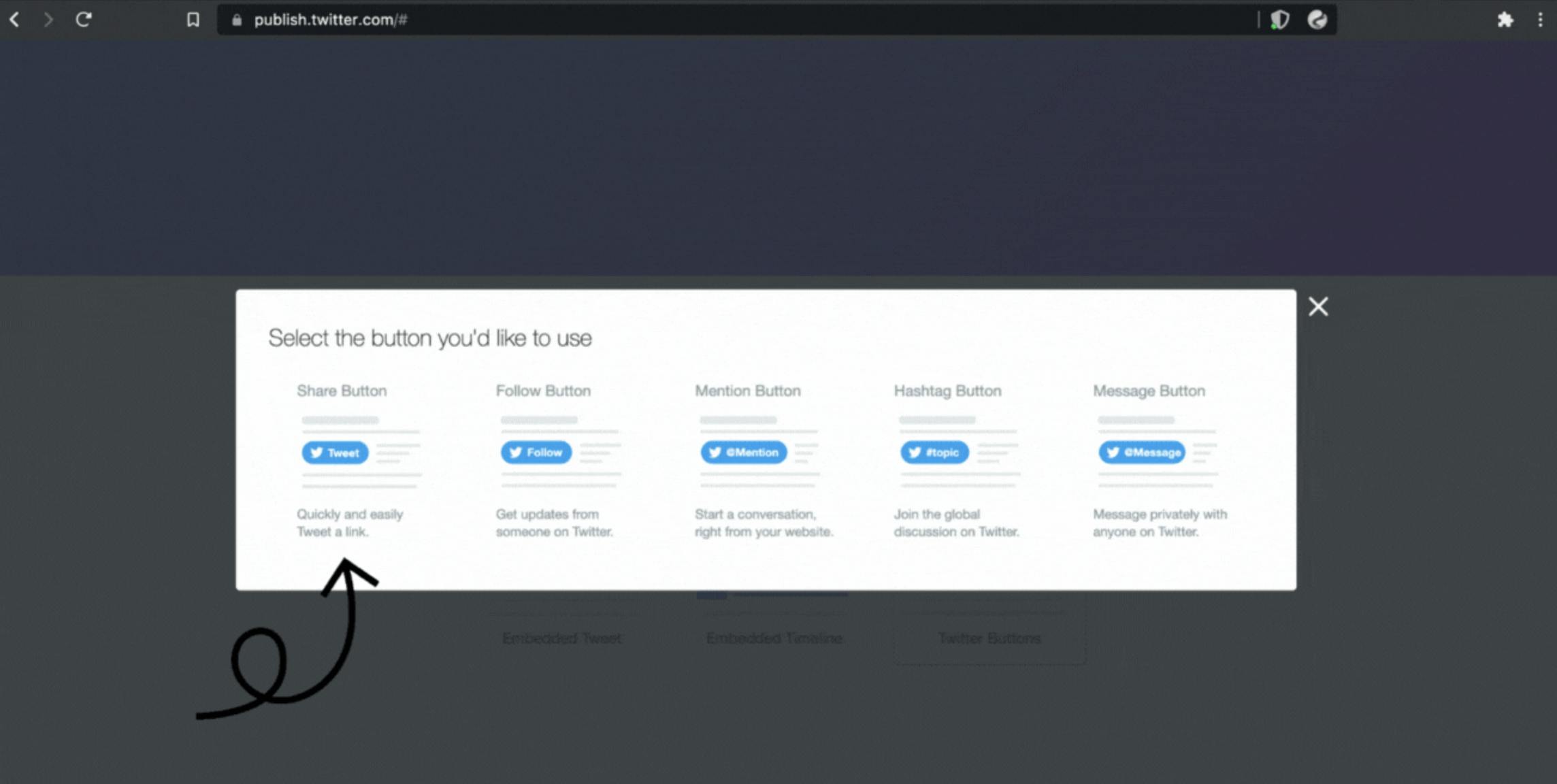
- Head over to publish.twitter.com.
- Click the Twitter Buttons section:
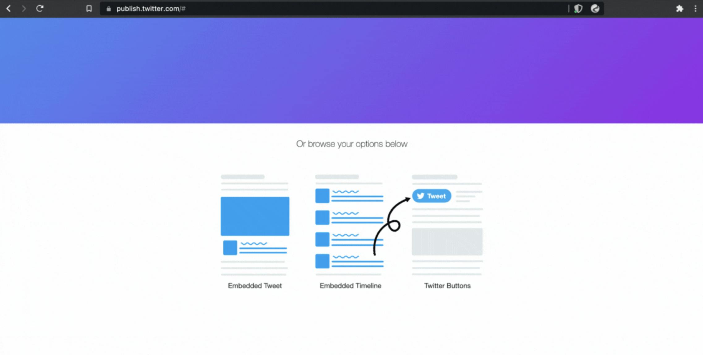
- Select the Share Button in this section:
- Then, you get everything you need. You can also set customization options:
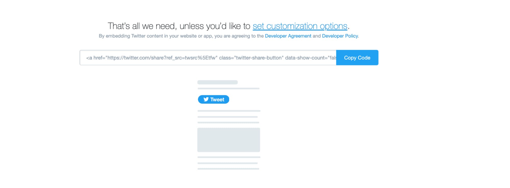
- You can now copy your code.
After copying the code, you can have it this way in your blog.hbs file:
<p style="text-align: center;">

          <a href="https://twitter.com/share?ref_src=twsrc%5Etfw" class="twitter-share-button" data-text="Hey Everyone, I just published an article. Please, do well to read and share with your friends. 🙏🏽❤️" data-show-count="false">Tweet</a><script async src="https://platform.twitter.com/widgets.js" charset="utf-8"></script>

</p>
You have the option of centering the button. In this case, I had to put the button in a paragraph and used an inline CSS that helped to align the button to the center.
Building the commenting section for the blog
We will be using Hyvor’s commenting system for this. In this case, we want the comment section to be placed after the code for the share to Twitter button.
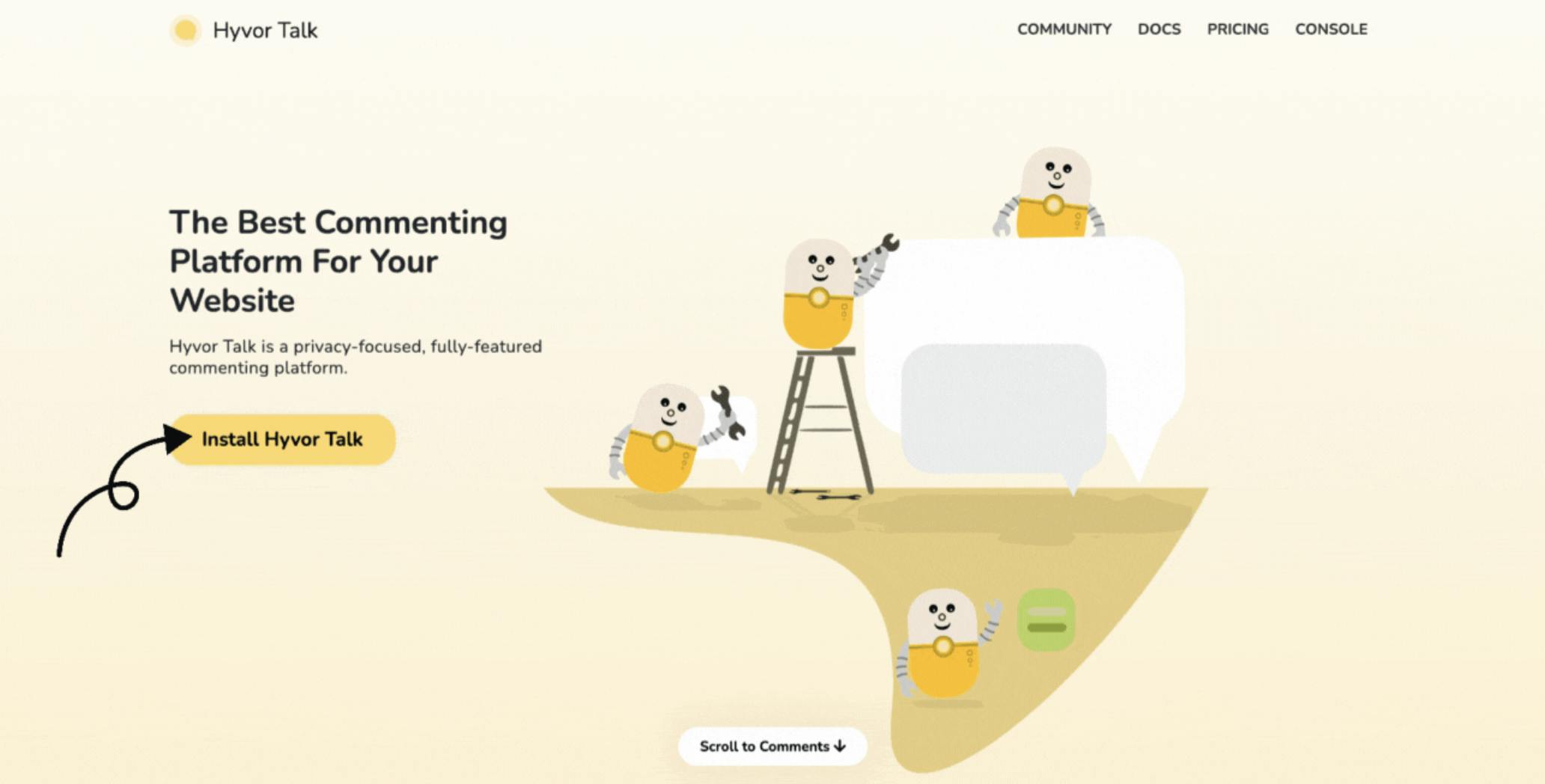
- First step: Visit Hyvor Talk, and click on the “Install Hyvor Talk” Button:
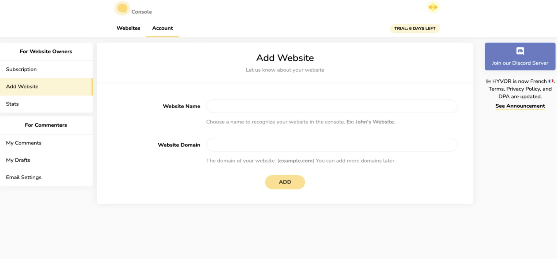
Create a Hyvor Talk account: Fill in all the required credentials and ensure you verify your Hyvor Talk account.
Add your website name and domain: You need to choose a name to recognize your site. Same thing for the domain too - you could use
localhost:3000if you'd like to run it locally. If you don’t use the correct domain, the comment section will give an error.
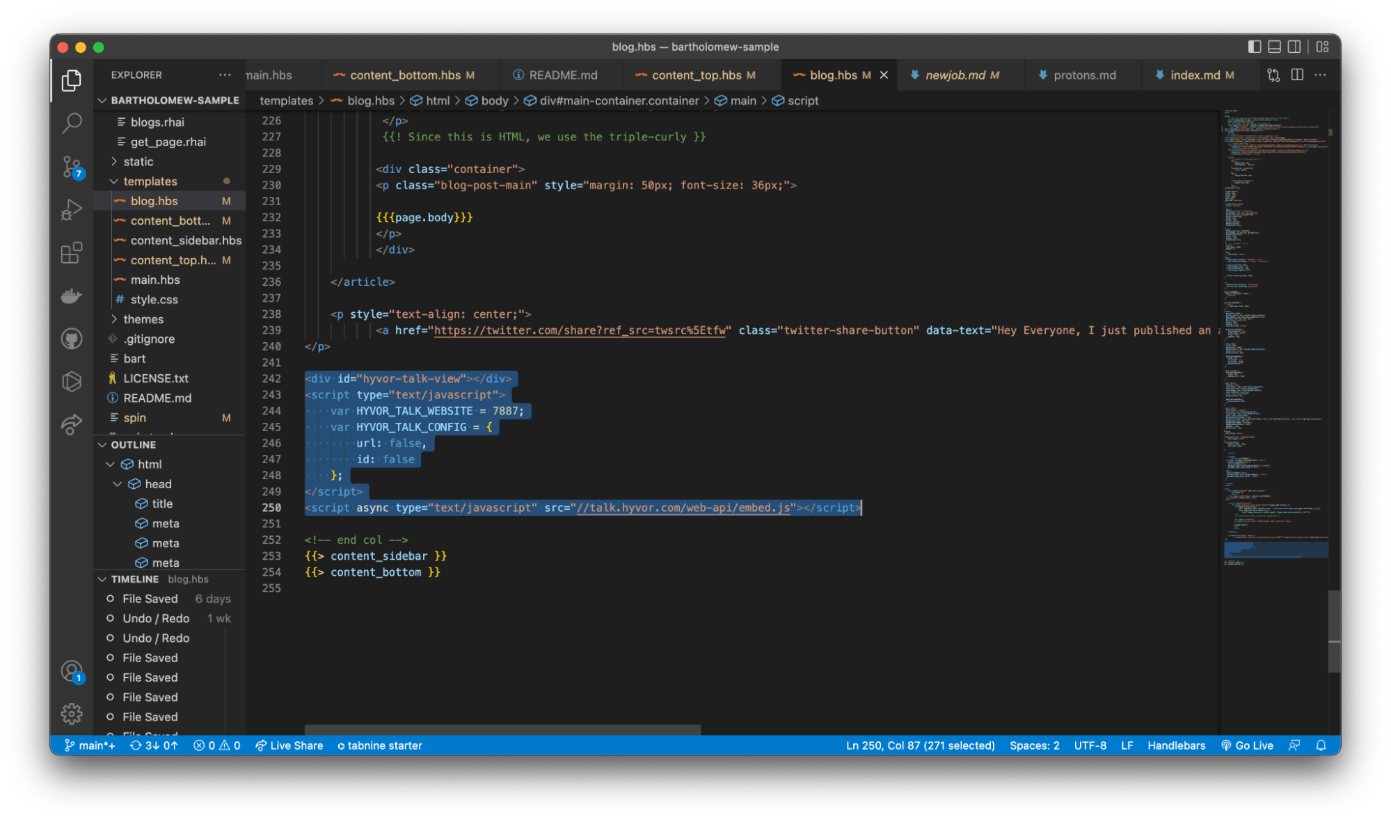
- Copy and paste the embed code in the ‘blog.hbs’ file:
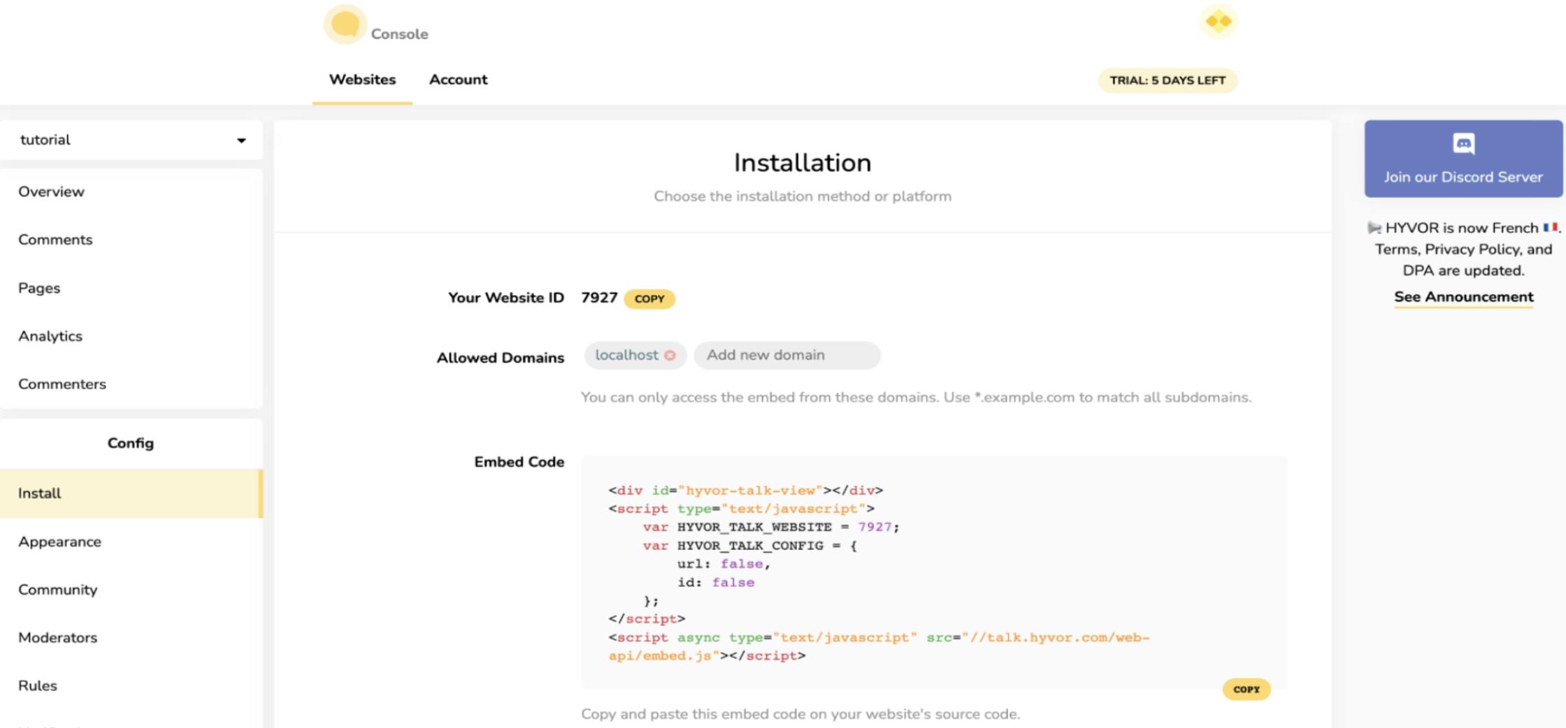
- The code should be in the
blog.hbsfile just like this:
Setting up the markdown
Now that we’re done with the layout of the pages, it’s time to add some content to the Markdown files. You can read the Markdown guide in Bartholomew.
Here is a code that shows you how to start a markdown in Bartholomew:
title = "I'm excited to share that I'm joining Fermyon as a DevRel 🥑"

date = "2022-09-14T17:31:11.972817Z"

template = "blog"

tags = []

description = "Can't be more excited! We can get the cats out of the bag already. In this post, I'll be sharing stuff about my new role and even what you should expect from me in this era..."


[extra]

type = "post"

author = "Opemipo Disu"

images = "https://kinsta.com/wp-content/uploads/2018/04/visual-content-strategy-2.png"


---


<!-- Ideally, for SEO there should be an image after the first paragraph or two -->


<img src="https://cdn.hashnode.com/res/hashnode/image/upload/v1607528824749/PYPzjuMw3.jpeg"

    alt="Markdown Monster icon"

    style="position: relative;

   z-index: 1;

   width: 100%;

   max-width: 944px;

   overflow: hidden;

   margin: 0px auto;

    display:block;

       margin-left: auto;

       margin-right: auto;

       border-radius: 18px;" />
Firstly, you’ll notice we have a title. The title is connected to the {{page.head.title}} string we have in the main.hbs file, just as some other meta information like the date, and description is working with the blog.hbs file. The blog.hbs file is responsible for the main article’s page itself. Now that you’re done with the templating, it’s left for you to start creating content.
One thing you’ll notice in the code above is that there is an HTML code for the image, I added that because markdown files support it, and then I added some inline CSS codes to help adjust or fit in the image. The live demo for this article is available.
Conclusion
You just need to understand how the templates work and how they are linked to each other. Note that just the blog.hbs file is the only file that isn’t linked with any page, so we had to start all over again for the page. It can be quite tricky to work with. The template is the main thing here, and you must be extremely cautious with the strings. There’s one important string for you to add in the main.hbs file for providing cards based on the number of pages created. Each card should provide some information like the title, description, and a link to the specific Markdown file based on the strings in the card too.
I hope you found this article interesting. If you have any problems with creating this, you can reach out to me on Twitter, or you can join Fermyon’s Discord Server. We have a very great presence there. You can ask questions about this article and share your experience with us. Also, the code for this project is available on GitHub as you might want to check it out or rebuild on this.