


There are so many accessibility tools coming into the frontend space; it's a thing that's been evolving rapidly in recent years. Tools that utilise the JAMstack (mostly) have been the most visible form of accessibility in frontend development. In this article, you will learn how you can create a component with MightyMeld using NextJS as its technology for building. You will learn why Next and MightyMeld are a great combination for creating components.
Basically, everything here is about frontend, and if you're a frontend developer who uses Next and you're trying to make work seamless for you, this article is for you.
Prerequisites
If you're reading this article, you should have the following:
Node 16.0 or higher installed on your machine.
npx 5.2 or higher, although this comes with the latest npm.
A basic knowledge of NextJS.
Knowledge of how to run a SWC plugin (that's what we will be using since we're using Next).
What is MightyMeld?
MightyMeld is a visual development tool that aims to provide seamless development for React developers. It's basically used for building React applications through visualisation. Hence, what you see is what you get in this context. It allows you to drag and drop, duplicate components; it could also serve as a code generator for your components; this doesn't mean it is a code generator; it even works with the code you have or developer setup directly.
MightyMeld can be used in lots of different ways. The main benefit is how it lets you click on a live view of your app to select React components and JSX elements. From there, you can quickly edit props and attributes, drag in new components, etc. When you create your UI, you’re thinking about (and looking at) what the UI looks like, rather than writing code. But the code that MightyMeld generates is designed to look as much as possible like what you would have written. MightyMeld works with different tools like Vite, Chakra UI, Tailwind, etc. Let's get our hands dirty!
Creating a component with MightyMeld + Next
Basically, we won't be creating an entire project from scratch; rather, we will be cloning an available one on MightyMeld's GitHub; it has Chakra UI configured in it already, so this way it has a system that works for it already. We will find out how to create a component in this section.
Configure your developer setup: Firstly, configure your developer environment. Start by cloning this repository. That's what we will be using for everything; you can choose to modify anything at this point. After cloning the repository, install this dependency in your project:
  git clone https://github.com/mightymeld/mightymeld-next-chakra-starter-ts.git
  npm install
After it's been successfully cloned, follow these instructions to get your secrets file:
npx mightymeld secretsWhen you've done this, you have to navigate to that link to install your
mightymeld.secretsfile. Note that the file should remain private for you only. When you navigate to the link given on your terminal, you can create a MightyMeld account or login if you have one, and then you will find a button that gets you to download the secrets file. Themightymeld.secretsfile should be in the main path of your project.Getting familiar with the Visual Development Environment: Notice that there is an SWC plugin installed. That’s required for MightyMeld to work, and if you set it up on your own project, you’ll need to install it yourself. You can check this for more information on it:
  const { pluginoptions } = require('@mightymeld/runtime');

  const nextConfig = {
   experimental: {
   swcPlugins: [['@mightymeld/runtime/swc-plugin-mightymeld', pluginoptions()]]
   }
  };

  module.exports = process.env.MIGHTYMELD ? nextConfig : {};
Without that configuration, you won't be able to see what you're building; that's why it's essential. Run the
npx mightymeldcommand again, and you'll be redirected to the browser where you can find the MightyMeld Studio or Visual Development Environment just like this:
Creating a component: Creating a component is super easy, all you have to do is navigate to the Chakra tab on the first sidebar, there is a range of default components by Chakra that you can use as seen in the image above. But in this case, we will be creating a simple button as a component.
Firstly, you should click on the main page; the UI where the "Mightymeld-Next-Chakra-Starter" shows, then you should find a structure pop-out in the second sidebar. Drag and drop the button component from the first sidebar to the second just like this:

This way, you will see the button in your UI, and you can style it in the studio if you want to. After styling (not necessary), left-click the src/ directory in the App tab and select the "Create new file" option. You can choose to give it any name; in this case, I'll give it Btn.tsx. Now, left-clicking the file name on the same sidebar, you then choose the option of creating a blank component - so choose that.

Add this code to the file you created for the component, and you can now embed the component provided by Chakra UI just like this:
  import { Button } from "@chakra-ui/react";

  const Example = () => {
    return (

        <Button variant="primary">Click Me!!</Button>

    );
  };

  export default Example;
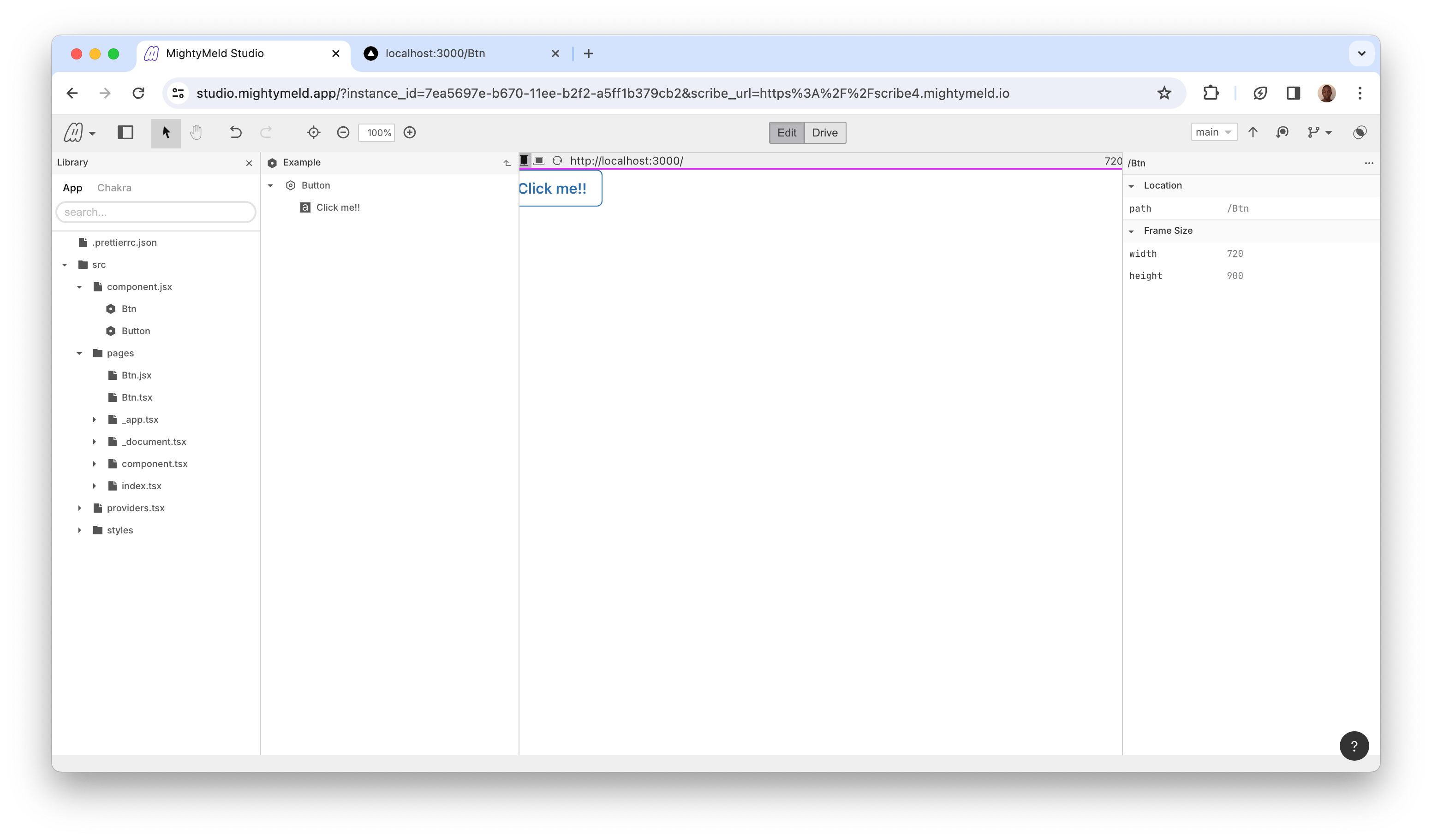
Just navigate to the path of your file; for example, mine is localhost:3000/btn, then you can see what you've done this way. You can style it when you navigate to that path in the embedded browser on the MightyMeld Visual Development Environment. You should get something like this:
That's it as it's super easy!
There's a great synergy between NextJS and MightyMeld in component creation; it's an easier way to create components. It's really a great combination; it's a faster way to create components because it's all visualized and provides some great transparency. You get to see how the code is structured and how it works in the entire project. You may be wondering why it's just a perfect combination. It's a perfect combination because of its efficiency, not just in terms of component creation but also in building it's entire UI.
Conclusion
I hope you enjoyed reading this article. Basically, you can see that this article covers two things (mostly): how to create a component in MightyMeld using Next and also how useful it can be. This article also covers how MightyMeld works with frameworks. In this context, we used Chakra UI and saw it's in-built components and how they could be utilised in MightyMeld.
Thanks for coming this far with me in this article. I hope to have you read my next article. See you!